Safari 26 and Liquid Glass have little respect for web sites
Apple recently announced version 26 of their operating systems, which feature a new appearance they call Liquid Glass. They say this design “brings more focus to content and a new level of vitality.” For Safari, this means there is no longer a clear separation between your web site and UI elements like the toolbar and sidebar. Toolbar buttons are placed on top of your web site, and Safari attempts to extend your layout underneath them.
For some web sites, this approach works well. In other cases, it does not, and Apple has decided not to give web site developers control over how their pages are modified to fit their browser design. I think this is pretty disrespectful to web site developers and it makes me angry how frequently they say they’re “driven by the goal of bringing greater focus to content” and “establishing greater harmony between hardware, software, and content.” The new UI even consumes more space than before, so there’s less room for your content than ever.
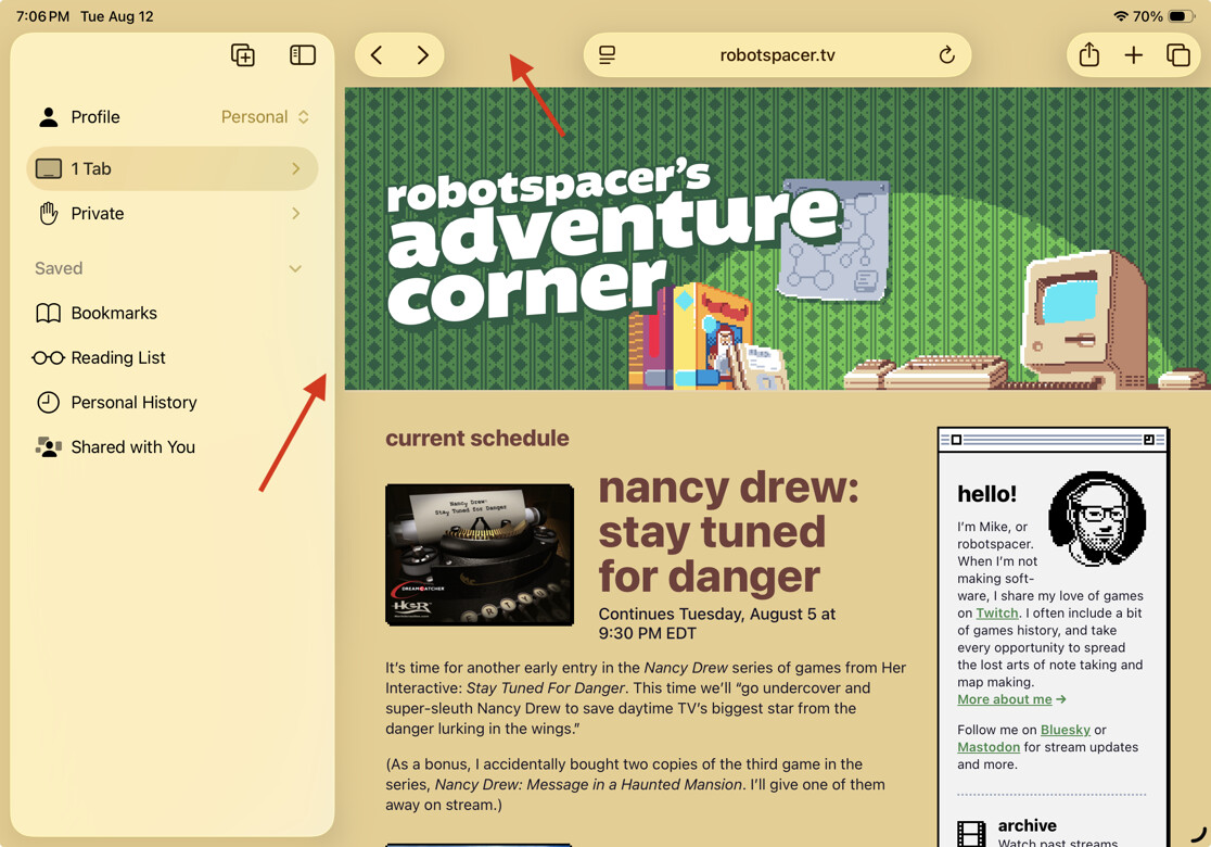
I was unhappy with how one of my web sites looks in particular. The screenshot above is taken from iPadOS 26 beta 6. It looks roughly the same in macOS 26 beta 6. The red arrow at the top points to what used to be the toolbar area. It is now filled with the background color for the body element. I would prefer to have this area filled with the green wallpaper pattern below it. My second choice would be to make it green so it blends with the wallpaper pattern reasonably well.
Apple created a similar problem when they redesigned Safari last year, giving the toolbar a similar transparent design by default. To solve this, they introduced a new meta tag, theme-color. This made it possible to specify a color for the toolbar area. It was a reasonable solution to the design problem they created, and I was happy enough with how this site looked.
Safari 26 ignores the theme-color. I initially assumed they had come up with a better solution to give developers more control over their web sites. Perhaps they were making use of safe areas, a concept that’s used on recent iPhone and iPad screens to solve similar design issues. Now that I’ve had some time to dig into it, that does not seem to be the case. Developers have even less control over the toolbar area than they did last year.
In addition, Apple has created a new design problem with their updated sidebar appearance. In my screenshot, the arrow on the left is pointing to a gap between my web site layout and the sidebar. This looks like a mistake in my CSS, perhaps caused by some unintentional padding or margin, but that is not the case. This gap is part of the browser UI, and Apple chose to fill this area with the background color for the body element. I hoped it would be possible to extend my wallpaper pattern all the way across, but currently there is no way to do that.
I find it pretty arrogant that Apple thinks it OK to integrate their browser UI into my web site. To do that and fail to give me any control over the appearance is incredibly disrespectful—both to me as a web site developer and to the content they claim to care so deeply about.
Link to this entry: https://mikepiontek.com/go/9777